Project
Amber Specialty Pharmacy Mobile App Launch and Provider Portal Branding
Roles
Application launch
Strategy
Naming
Brand design
“We’ve invested so much into these technology launches, how can we get a rushed audience to care?”
Most users lack the space to download yet another app, much less use it consistently. And most healthcare providers resist engaging yet another portal.
For the mobile app launch, my team created a campaign leaning on condensed, benefit-driven copy. We also incorporated equally stripped-down, vibrant design assets capable of supporting the message.
Refreshing the provider portal required a compelling mark explicitly voicing the new offer: use this portal to stay “current” on referrals sent over.
Now the app has hundreds of daily users and the portal enjoyed a 1525% increase in signups.
Launching the client portal:
I named the portal, “Current” to underscore the essence of its core offering: a way for providers to stay up-to-date (current) with referrals sent through the pharmacy teams.
The logo mark leverages the brand colors layered in a horizontal gradient to convey forward movement.
Heavily modifying a slanted slab serif typeface communicated a level of technological sophistication and proprietary.


Launching the client portal:
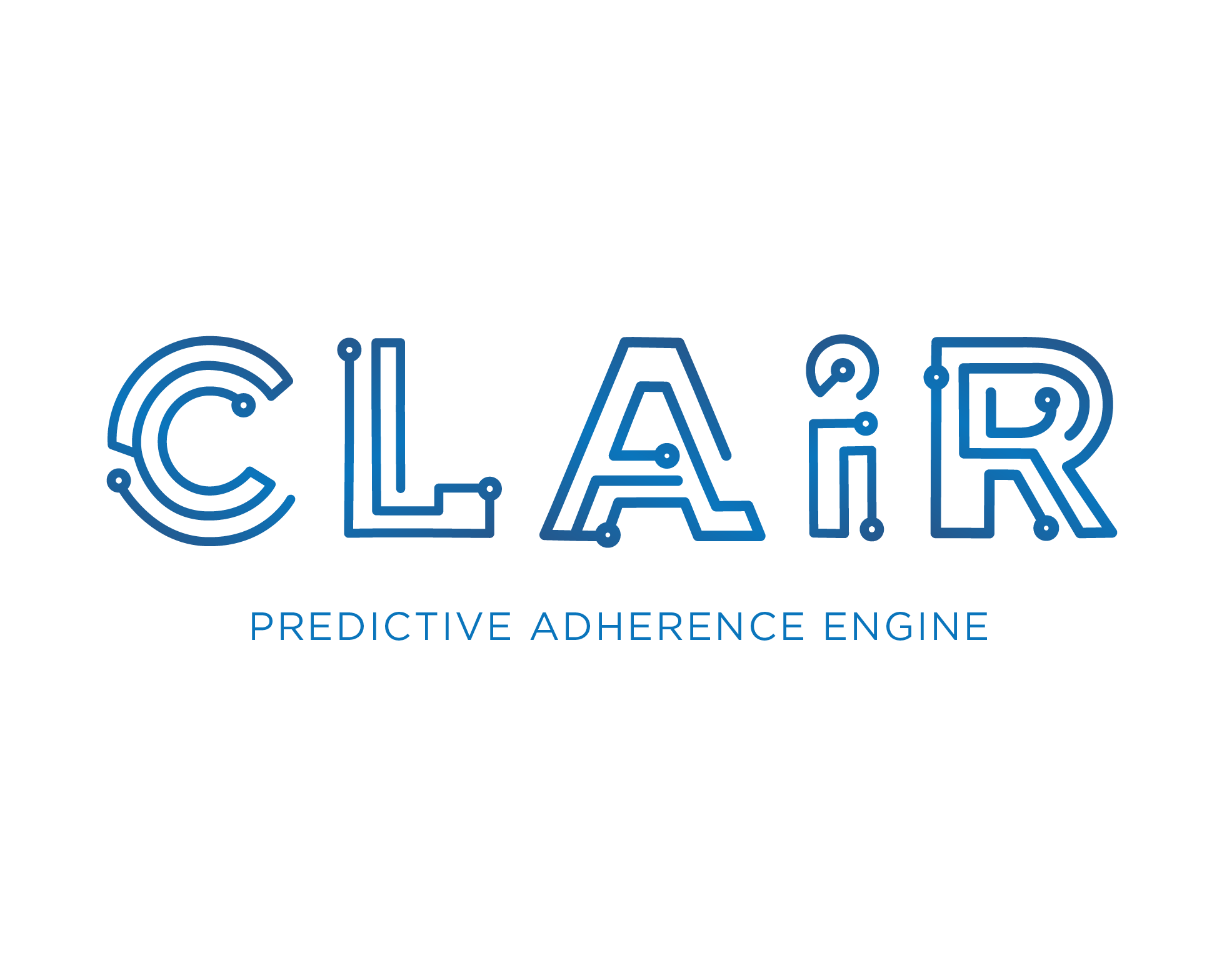
New a.i. technology needed a face and a name. The magic of the program was that it used machine learning to predict when a patient would miss a dose, allowing the team of clinicians to intervene. It felt Clairvoyant, or “Clair” for short.